3 Descriptives and visualizations
3.1 Overview
In this section, I describe and visualize the variables. We got variables on the person-level and on the wave level.
Person-level
- Age and gender (
age,gender) - What region of the UK participants are from (
region) - Whether they’ve used a medium in the three months before the first wave (variables starting with
filter) - To what extent they identify with a medium (variables ending with
identity)
Wave-level
- How much they used a medium per wave (variables ending with
time) - Their well-being per wave (
well_being)
3.2 Person-level
Let’s have a look at the final sample. Overall, our sample size is N = 2159. Participants, on average, were M = 47 years old, SD = 14.6, see Figure 3.1. The gender distribution is pretty equal (1123 women (52.01%), 1035 men, and 1 non-binary participants).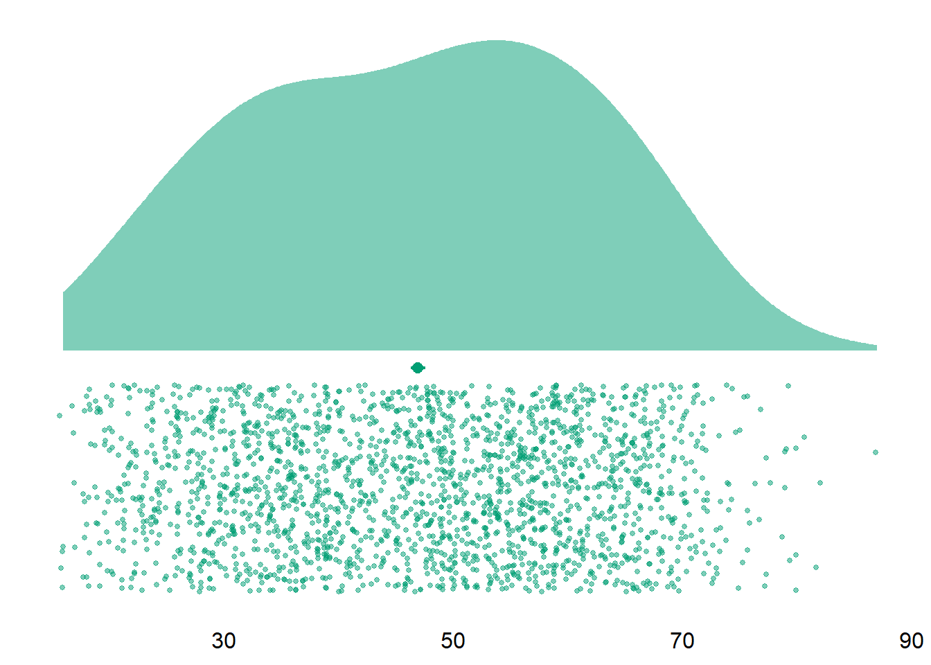
Figure 3.1: Distribution of age
| Medium | Used | Not Used | Proportion |
|---|---|---|---|
| audiobooks | 274 | 1885 | 12.7 |
| ebooks | 1032 | 1127 | 47.8 |
| films | 1339 | 820 | 62.0 |
| magazines | 498 | 1661 | 23.1 |
| music | 1420 | 739 | 65.8 |
| tv | 1310 | 849 | 60.7 |
| video_games | 624 | 1535 | 28.9 |
| Waves | N | Mean age | SD age | Women | Men | Other | Proportion women (%) |
|---|---|---|---|---|---|---|---|
| 1 | 982 | 40.64766 | 17.66912 | 448 | 531 | 3 | 46 |
| 2 | 402 | 42.98259 | 15.97183 | 192 | 210 | 0 | 48 |
| 3 | 219 | 43.27854 | 16.47406 | 113 | 106 | 0 | 52 |
| 4 | 174 | 44.81609 | 16.11414 | 99 | 75 | 0 | 57 |
| 5 | 831 | 48.41516 | 13.63305 | 435 | 395 | 1 | 52 |
| 6 | 1022 | 46.15753 | 14.63435 | 515 | 506 | 1 | 50 |
| variable | N | mean | sd | median | min | max | range | cilow | cihigh |
|---|---|---|---|---|---|---|---|---|---|
| music_identity | 1420 | 2.19 | 0.67 | 2.14 | 1 | 4 | 3 | 2.16 | 2.23 |
| tv_identity | 1310 | 2.16 | 0.63 | 2.14 | 1 | 4 | 3 | 2.13 | 2.20 |
| films_identity | 1339 | 2.26 | 0.67 | 2.14 | 1 | 4 | 3 | 2.22 | 2.29 |
| games_identity | 624 | 2.48 | 0.82 | 2.43 | 1 | 4 | 3 | 2.42 | 2.55 |
| e_publishing_identity | 1211 | 2.33 | 0.69 | 2.29 | 1 | 4 | 3 | 2.29 | 2.37 |
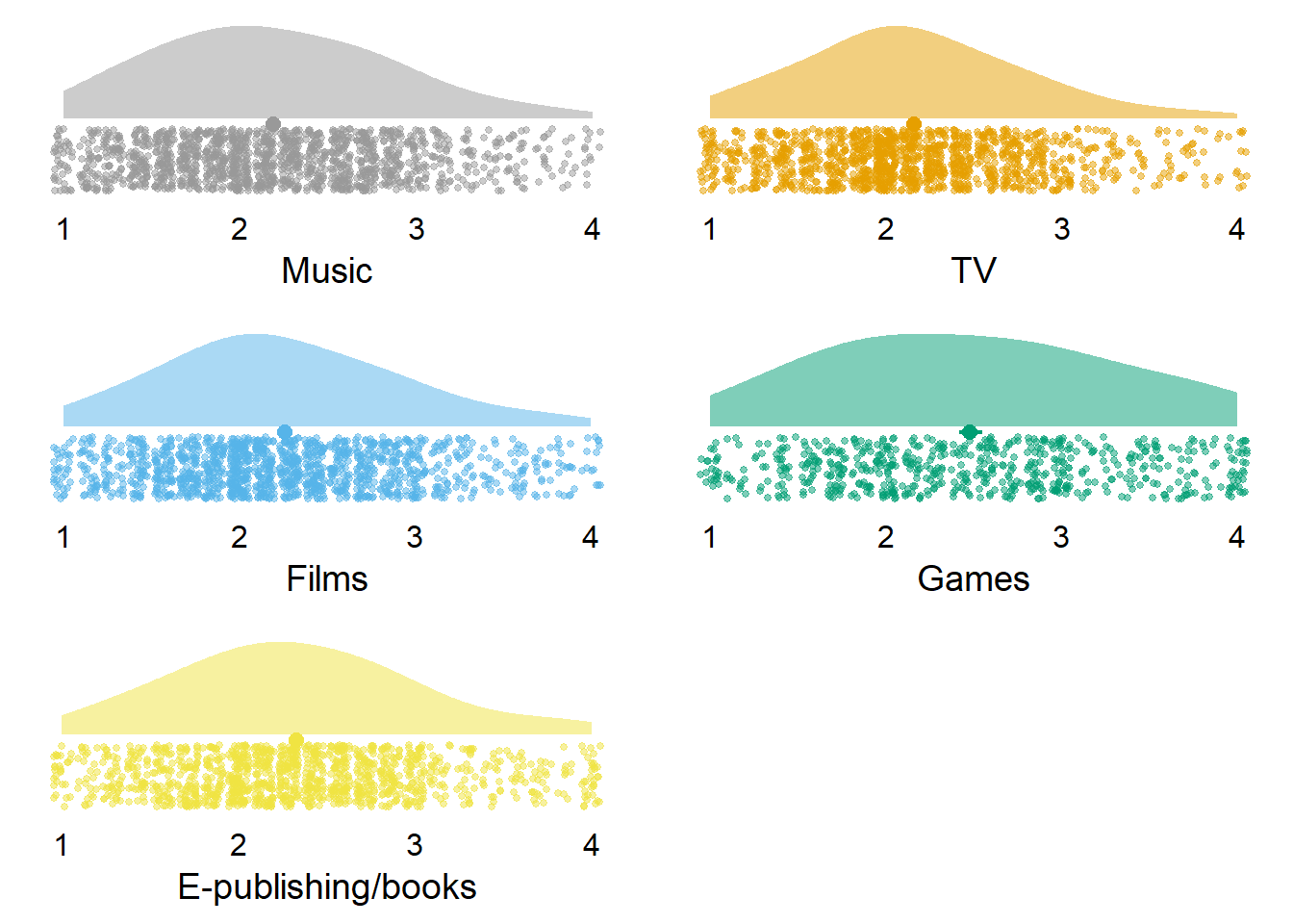
Figure 3.2: Distribution of identity variables
3.3 Wave-level
Let’s inspect the descriptive information for the different media. Table 3.4 shows that people used TV, music, and films the most, but spent little time on magazines and audio books.| variable | N | mean | sd | median | min | max | range | cilow | cihigh |
|---|---|---|---|---|---|---|---|---|---|
| music_time | 10985 | 2.28 | 2.57 | 2.00 | 0 | 22.22 | 22.22 | 2.24 | 2.33 |
| tv_time | 10985 | 3.25 | 3.38 | 2.50 | 0 | 22.00 | 22.00 | 3.18 | 3.31 |
| films_time | 10985 | 2.33 | 2.62 | 2.00 | 0 | 22.25 | 22.25 | 2.28 | 2.37 |
| games_time | 10985 | 0.98 | 2.24 | 0.00 | 0 | 22.00 | 22.00 | 0.94 | 1.02 |
| books_time | 10985 | 1.09 | 1.96 | 0.17 | 0 | 21.00 | 21.00 | 1.05 | 1.12 |
| magazines_time | 10985 | 0.24 | 0.87 | 0.00 | 0 | 20.00 | 20.00 | 0.23 | 0.26 |
| audiobooks_time | 10985 | 0.16 | 0.78 | 0.00 | 0 | 20.00 | 20.00 | 0.15 | 0.18 |
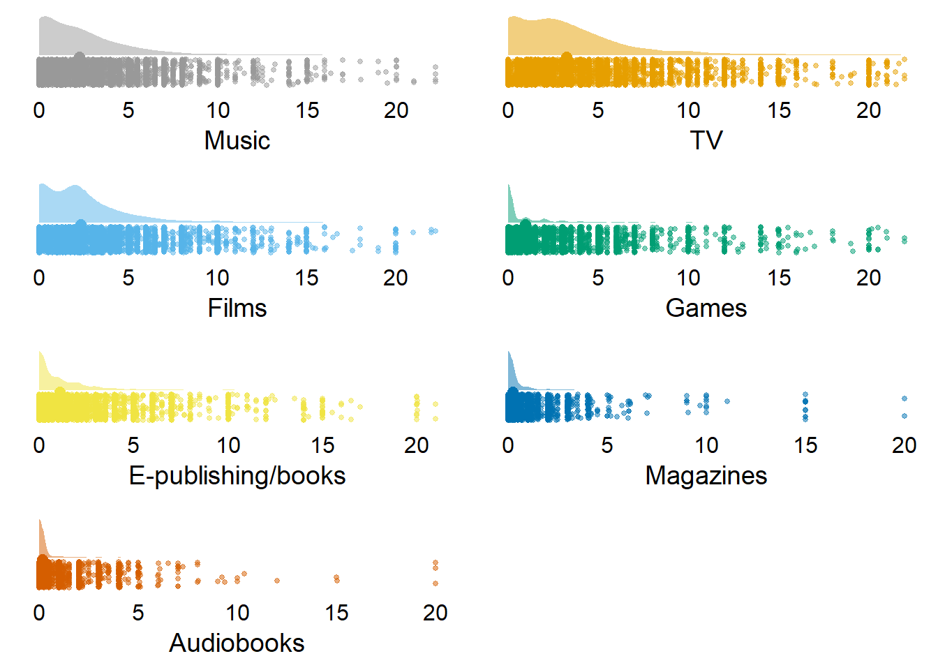
Figure 3.3: Distribution of time variables (with zeros)
| variable | N | mean | sd | median | min | max | range | cilow | cihigh |
|---|---|---|---|---|---|---|---|---|---|
| music_time | 8251 | 3.04 | 2.54 | 2.25 | 0.02 | 22.22 | 22.20 | 2.99 | 3.09 |
| tv_time | 8537 | 4.18 | 3.29 | 3.00 | 0.02 | 22.00 | 21.98 | 4.11 | 4.25 |
| films_time | 7956 | 3.21 | 2.58 | 2.33 | 0.02 | 22.25 | 22.23 | 3.15 | 3.27 |
| games_time | 3873 | 2.78 | 3.04 | 2.00 | 0.02 | 22.00 | 21.98 | 2.69 | 2.88 |
| books_time | 5561 | 2.14 | 2.31 | 1.50 | 0.02 | 21.00 | 20.98 | 2.08 | 2.21 |
| magazines_time | 2442 | 1.09 | 1.58 | 0.67 | 0.02 | 20.00 | 19.98 | 1.03 | 1.16 |
| audiobooks_time | 1101 | 1.64 | 1.93 | 1.00 | 0.02 | 20.00 | 19.98 | 1.52 | 1.75 |
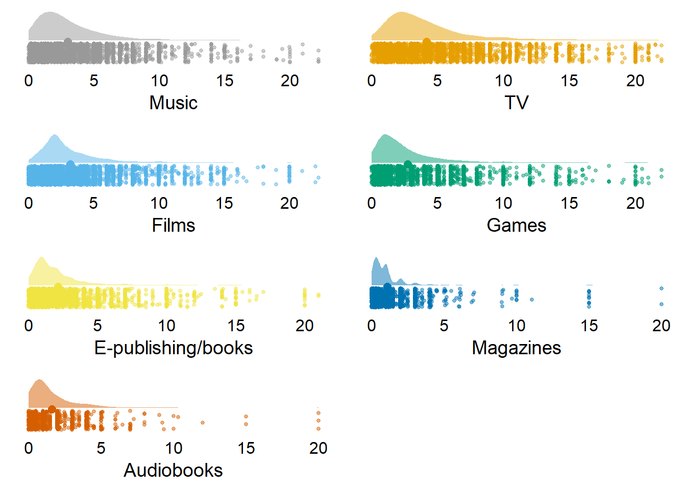
Figure 3.4: Distribution of time variables (without zeros)
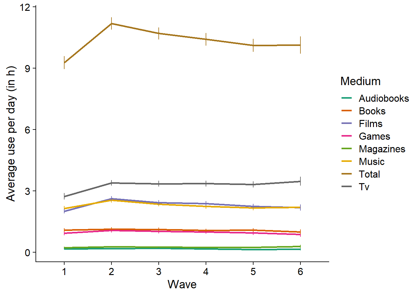
Figure 3.5: Average use over time per medium
| variable | N | mean | sd | median | min | max | range | cilow | cihigh |
|---|---|---|---|---|---|---|---|---|---|
| affect | 10985 | 5.94 | 2.18 | 6 | 0 | 10 | 10 | 5.90 | 5.98 |
| life_satisfaction | 10985 | 6.40 | 2.08 | 7 | 0 | 10 | 10 | 6.37 | 6.44 |
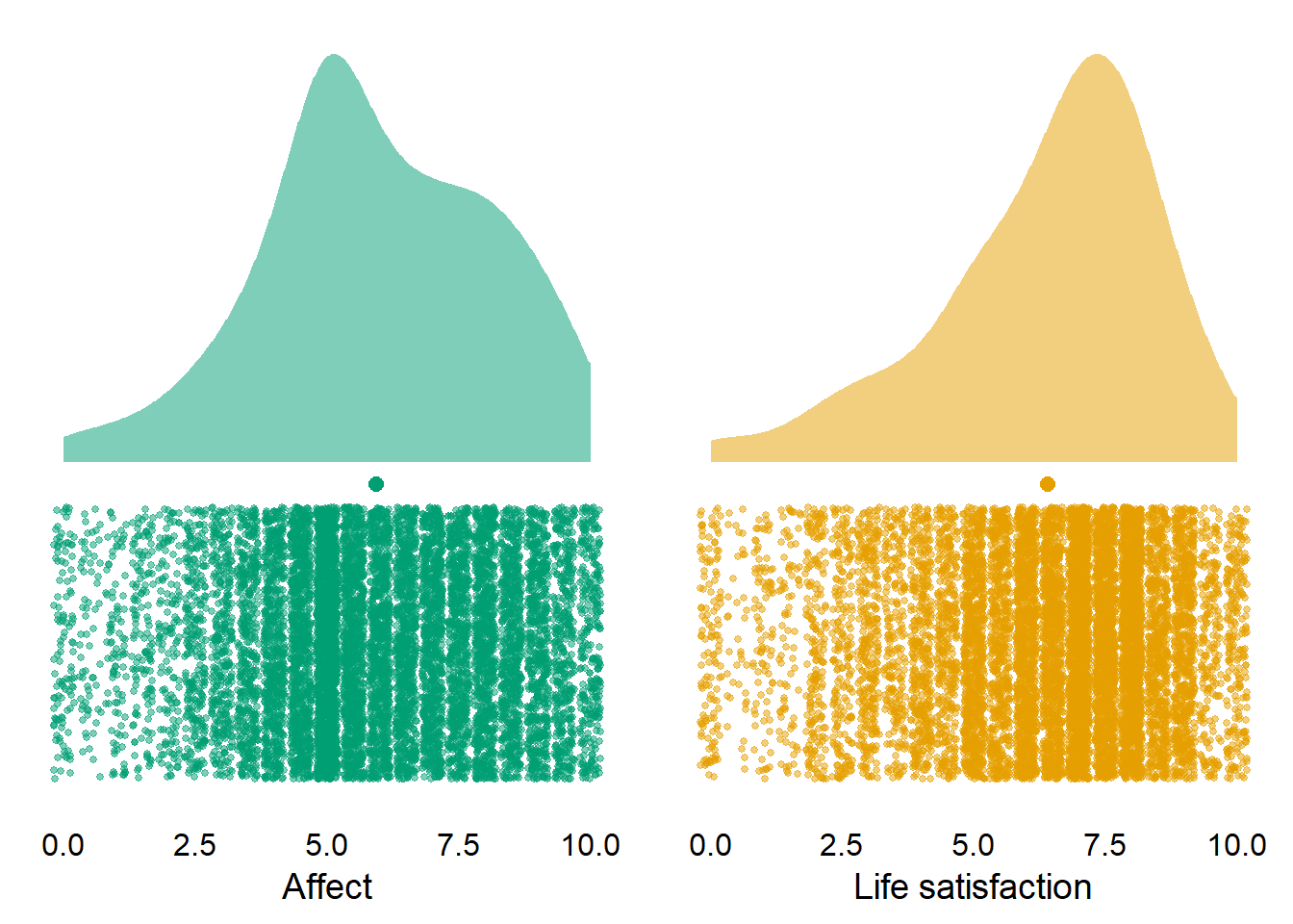
Figure 3.6: Distribution of well-being across waves and participants
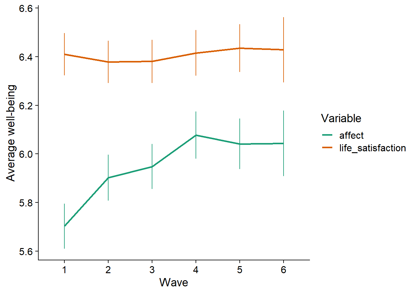
Figure 3.7: Average estimates over time per medium
3.4 Correlation matrices
Let’s have a look at the row correlations between the media use variables and well-being. Figure 3.8 shows that a) most media use is correlated, and b) there are negative, but very small correlations between well-being and media use. The significance is negligible here just because the sample is so large. That said, we haven’t done any grouping yet, so the correlation matrix treats all observations as independent, which is clearly not the case.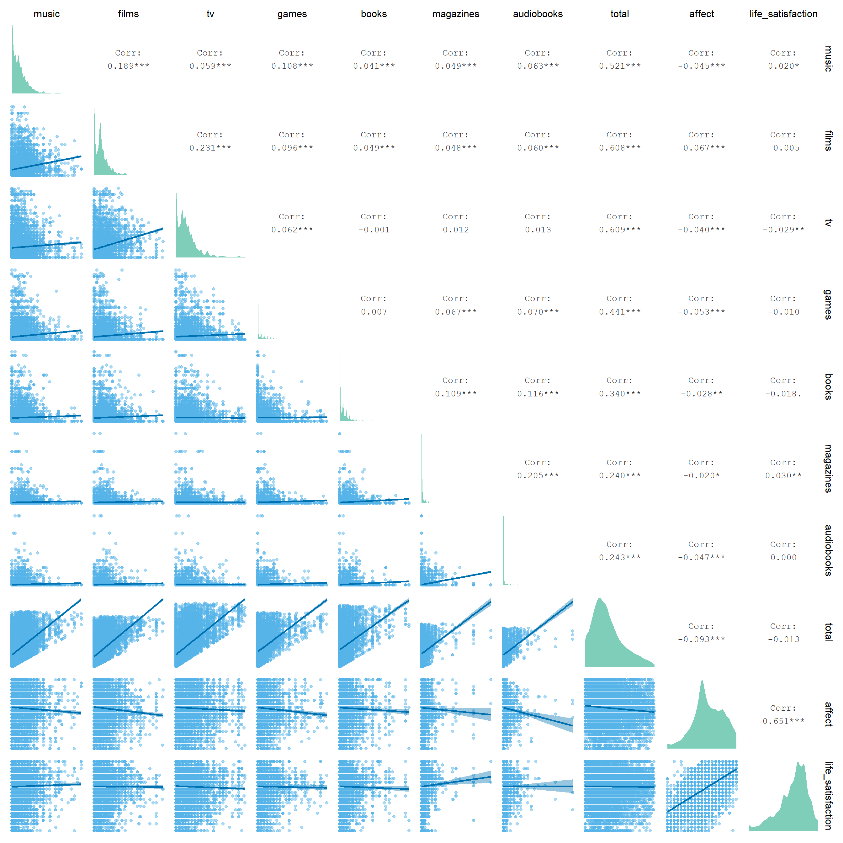
Figure 3.8: Correlation matrix of hours spent with a medium and well-being
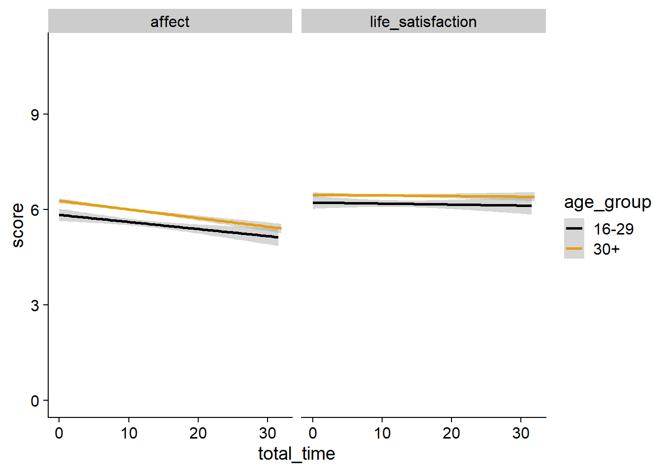
Figure 3.9: Relation between total time and well-being by age
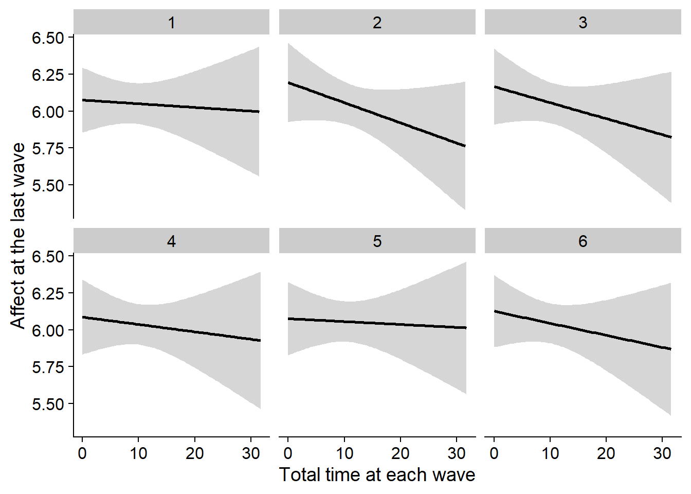
Figure 3.10: Correlation between affect at the last wave and total time at each wave
3.5 Plots for Paper
For the paper, I want to avoid confronting readers with blocks of numbers. Therefore, I’ll try to put as much info as possible into figures rather than tables or in-text reports of numbers.
I think the following plots are necessary for the paper:
- A plot of the response rate per wave, simply as a descriptive measure.
- A plot showcasing the exclusions. I’ll describe the exclusion criteria in the paper, but don’t want to overwhelm readers with numbers for each.
- A plot showing the distributions, M, and SD of media use for different categories.
- Same plot, but for well-being.
- A plot of the results.
First, a plot for the response rate for each wave.
We already showed response rates as a table in the processing section, so we can re-use the completion_table object for a plot.
Not sure about the colors yet, might go all black for this one.
ggplot(
  data = completion_table %>%
    rename(
      Wave = Waves,
      `Participants per wave (%)` = `Participants per wave`
    ) %>%
    mutate(
      Wave = as.factor(Wave)
    ),
  aes(
    x = Wave,
    y = `Participants per wave (%)`#,
    # color = Wave,
    # fill = Wave
  )
) +
  geom_segment(
    aes(
      xend = Wave,
      y = 0,
      yend = `Participants per wave (%)`
    ),
    size = 1
  ) +
  geom_point(
    size = 2
  ) +
  geom_text(
    aes(
      label = paste0(`Participants per wave (%)`, "(", `Frequency per wave`, "%)"),
      y = `Participants per wave (%)` + 160
    )
  ) +
  scale_colour_manual(values=cb_palette) +
  scale_fill_manual(values = cb_palette) +
  theme(
    legend.position = "none"
  ) -> figure1

figure1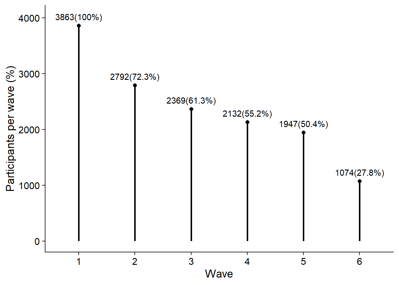
# create figure folder
dir.create("figures/", FALSE, TRUE)

ggsave(
  filename = here("figures", "figure1.png"),
  plot = figure1,
  width = 21 * 0.8,
  height = 29.7 * 0.4,
  units = "cm",
  dpi = 300
)
Next, I plot the exclusions.
There’s two ways to go about this.
Either I show the absolute number of participants and observations that we exclude with each criterion in relation to the total sample size.
I do that below.
Note that getting those exclusions in a nice format requires some wrangling.
I already created the exclusion_plot_data object in the processing section.
Here, I turn it into the long format first.
# to long format for plotting
exclusion_plot_data <-
  exclusion_plot_data %>%
  filter(!str_detect(Exclusion, "Total")) %>% # don't include the total numbers for now
  rename(Participants = PPs) %>% # nicer name
  pivot_longer(
    Participants:Observations,
    names_to = "Measure",
    values_to = "Value"
  ) %>%
  mutate( # create new variable that's stable across exclusions
    Total = case_when(
      Measure == "Participants" ~ exclusion_plot_data %>% filter(Type == "Total") %>% pull(PPs),
      TRUE ~ exclusion_plot_data %>% filter(Type == "Total") %>% pull(Observations),
    ),
    `Total Before` = case_when(
      Measure == "Participants" ~ exclusion_plot_data %>% filter(Type == "Total Before") %>% pull(PPs),
      TRUE ~ exclusion_plot_data %>% filter(Type == "Total Before") %>% pull(Observations),
    )
  ) %>%
  mutate(
    across(
      Type:Measure,
      as.factor
    )
  )

# https://stackoverflow.com/questions/11889625/annotating-text-on-individual-facet-in-ggplot2
# I want to show the total numbers once, not for each facet/criterion combination, which is why I create a data frame that only has a matching value for the positions in the plot that I want
label_positions <-
  tibble(
    Type = rep("Wave-level", 2),
    Exclusion = c(3, 3), # on the right, where wave-level exclusions are
    Measure = c("Participants", "Observations")
  ) %>%
  mutate(
    across(
      everything(),
      as.factor
    )
  )

# add the total values
label_positions <-
  left_join(
    label_positions,
    exclusion_plot_data %>% select(-Value)
  )

# then plot
ggplot(
  exclusion_plot_data,
    aes(
      x = Exclusion,
      y = Value,
      color = Type
    )
  ) +
  geom_segment(
    aes(
      x = Exclusion,
      xend = Exclusion,
      y = 0,
      yend = Value
    ),
    alpha = 1,
    size = 1
  ) +
  facet_grid(Measure ~ Type, scales = "free") +
  geom_point(alpha = 1, size = 2) +
  geom_text(
    aes(
      label = paste0("-", `Total Before` - Value),
      x = as.numeric(Exclusion) + 0.35,
      y = Total * 0.1
    )
  ) +
  geom_hline(
    aes(
      yintercept = Total
    ),
    linetype = "dashed"
  ) +
  geom_hline(
    aes(
      yintercept = `Total Before`
    ),
    linetype = "solid"
  ) +
  geom_text(
    data = label_positions,
    aes(
      label = `Total`,
      x = 3.3,
      y = Total * 1.05
    ),
    color = "black"
  ) +
  geom_text(
    data = label_positions,
    aes(
      label = `Total Before`,
      x = 3.3,
      y = `Total Before` * 1.05
    ),
    color = "black"
  ) +
  xlab("Exclusion Criterion") +
  scale_colour_manual(values=cb_palette) +
  scale_fill_manual(values = cb_palette) +
  theme(
    axis.title.y = element_blank(),
    legend.position = "none",
    panel.background=element_blank(),
    panel.border=element_blank(),
    panel.grid.major=element_blank(),
    panel.grid.minor=element_blank(),
    plot.background=element_blank(),
    strip.background = element_blank()
  ) -> exclusion_figure1

exclusion_figure1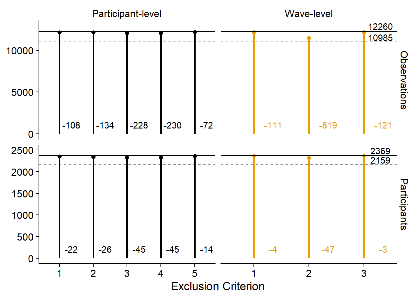
Alternatively, we could emphasize the contributions of each criterion in relation to the other criteria. Not sure I like this because it doesn’t show the total sample size and the reduction in total sample size. Then again, could simply add those to the figure captions.
ggplot(
  exclusion_plot_data %>%
    mutate(
      Value = `Total Before` - Value
    ),
    aes(
      x = Exclusion,
      y = Value,
      color = Type
    )
  ) +
  geom_segment(
    aes(
      x = Exclusion,
      xend = Exclusion,
      y = 0,
      yend = Value
    ),
    alpha = 1,
    size = 1
  ) +
  facet_grid(Measure ~ Type, scales = "free") +
  geom_point(alpha = 1, size = 2) +
  geom_text(
    aes(
      label = paste0(round(Value/`Total Before`, digits = 4) * 100, "%"),
      y = Value
    ),
    vjust = 1,
    hjust = -0.2,
    size = 3
  ) +
  xlab("Exclusion Criterion") +
  scale_colour_manual(values=cb_palette) +
  scale_fill_manual(values = cb_palette) +
  theme(
    axis.title.y = element_blank(),
    legend.position = "none",
    panel.background=element_blank(),
    panel.border=element_blank(),
    panel.grid.major=element_blank(),
    panel.grid.minor=element_blank(),
    plot.background=element_blank(),
    strip.background = element_blank()
  ) -> exclusion_figure2

exclusion_figure2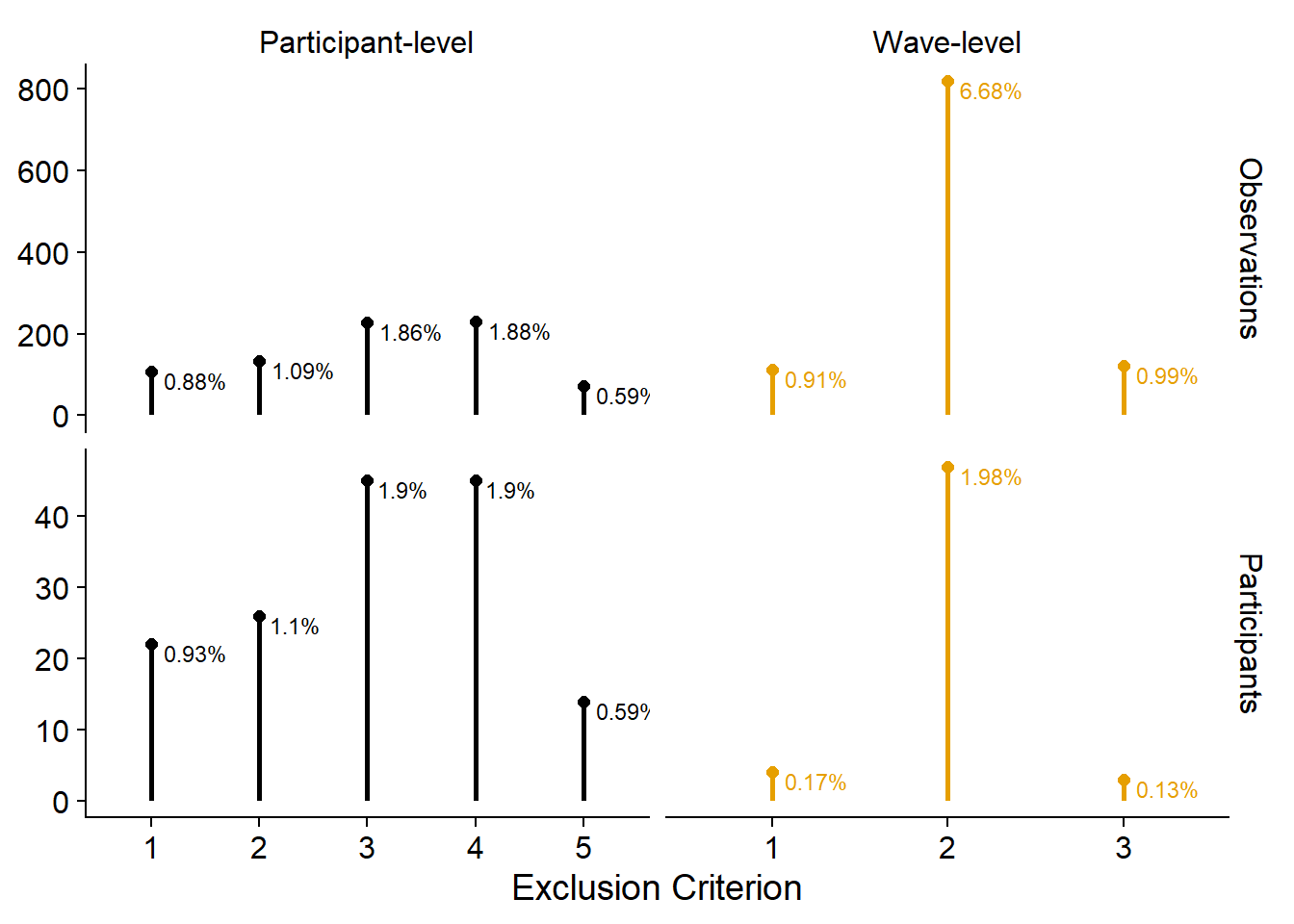
Next, I plot the distributions of the use variables. I want to show distributions, but there are a couple of single large values, so violin or density plots will look strange with a long tail. Raincloud plots could solve that to a degree, but they duplicate information. I’ll go with a doptplot, namely beeswarm plots.
Like before, because I facet, I’ll turn the data into the long format first. I’m also not sure whether I like vertical or horizontal beeswarms, so I’ll do both.
# temporary data file in long format
dat <-
  working_file %>%
  pivot_longer(
    contains("_time"), # only the time variables
    names_to = "measure",
    values_to = "Hours per day"
  ) %>%
  mutate(
    measure = as.factor(str_to_title(str_remove(measure, "_time"))), # prettier factor levels
    measure = fct_recode(
      measure,
      "TV" = "Tv"
    ),
    measure = fct_relevel(
      measure,
      c(
        "Music",
        "TV",
        "Films",
        "Games",
        "Books",
        "Magazines",
        "Audiobooks",
        "Total"
      )
    )
  )

# summary stats for plotting means over time
dat_summary <-
  dat %>%
  group_by(wave, measure) %>%
  summarise(
    mean = mean(`Hours per day`, na.rm = T),
    sd = sd(`Hours per day`, na.rm = T)
  ) %>%
  mutate(
    across(
      mean:sd,
      ~ round(.x, digits = 1)
    )
  )

# let's try horizontal first (the commented out section adds a vertical line where the mean is)
ggplot(
  dat,
  aes(
    x = `Hours per day`,
    y = 1,
    color = measure,
    fill = measure
  )
) +
  geom_quasirandom(groupOnX=FALSE, size = 0.1, alpha = 0.5) +
  # geom_vline(
  #   data = dat_summary,
  #   aes(
  #     xintercept = mean,
  #     color = measure
  #   ),
  #   linetype = "dashed"
  # ) +
  geom_point(
    data = dat_summary,
    aes(
      x = mean,
      y = 0.55
    ),
    shape = 25,
    size = 2
  ) +
  facet_grid(measure ~ wave) +
  geom_text(
    data = dat_summary,
    aes(
      x = 20,
      y = 1.4,
      label = paste0("M = ", mean)
    ),
    size = 3,
    color = "black"
  ) +
  geom_text(
    data = dat_summary,
    aes(
      x = 19.6,
      y = 1.3,
      label = paste0("SD = ", sd)
    ),
    size = 3,
    color = "black"
  ) +
  theme_cowplot() +
  scale_colour_manual(values=cb_palette) +
  scale_fill_manual(values = cb_palette) +
  theme(
    axis.text.y = element_blank(),
    axis.title.y = element_blank(),
    axis.ticks.y = element_blank(),
    axis.line.y = element_blank(),
    strip.background.x = element_blank(),
    strip.background.y = element_blank(),
    legend.position = "none"
  ) -> figure2.1

figure2.1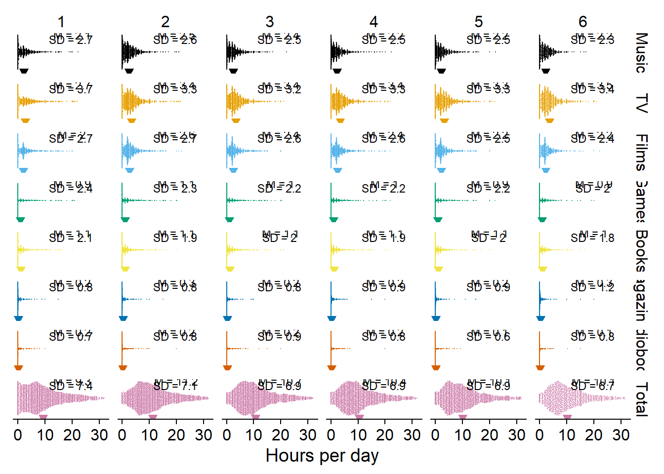
I guess the trendline makes it easier to see developments (or lack thereof) over time.
ggplot(
  dat,
  aes(
    x = as.factor(wave),
    y = `Hours per day`,
    color = measure,
    fill = measure,
    group = 1
  )
) +
  geom_quasirandom(size = 0.1, alpha = 0.2) +
  geom_line(
    data = dat_summary,
    aes(
      y = mean
    ),
    size = 1
  ) +
  facet_wrap(~ measure, ncol = 2) +
  geom_text(
    data = dat_summary,
    aes(
      x = as.factor(wave),
      y = -1.2,
      label = paste0("M = ", mean)
    ),
    size = 2.5,
    color = "black"
  ) +
  geom_text(
    data = dat_summary,
    aes(
      x = as.factor(wave),
      y = -2.9,
      label = paste0("SD = ", sd)
    ),
    size = 2.5,
    color = "black"
  ) +
  theme_cowplot() +
  scale_colour_manual(values=cb_palette) +
  scale_fill_manual(values = cb_palette) +
  xlab("Wave") +
  theme(
    strip.background.x = element_blank(),
    strip.background.y = element_blank(),
    legend.position = "none"
  ) -> figure2.2

figure2.2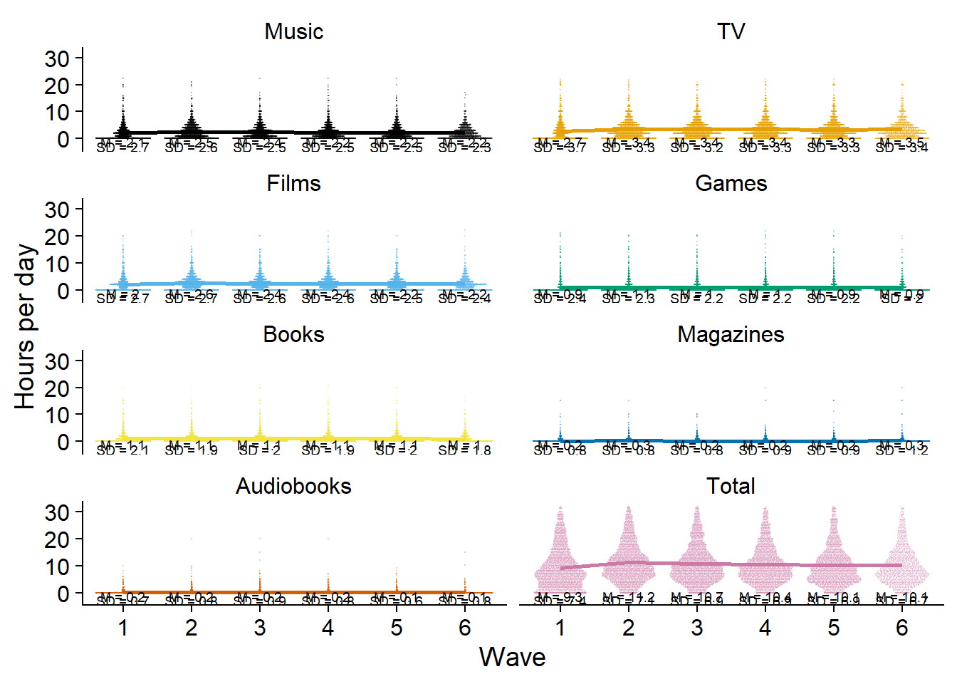
Then again, for distributions with a small mean, the trendline blocks everything. Plus, because total time extends the y-axis, there’s lots of white space. I’ll give total time its separate plot to solve that issue. I also won’t have trendlines for the separate media, only for the total (too lazy to write the above into a function, so I’ll copy paste the code from above.).
ggplot(
  dat %>%
    filter(measure != "Total"),
  aes(
    x = as.factor(wave),
    y = `Hours per day`,
    color = measure,
    fill = measure,
    group = 1
  )
) +
  geom_quasirandom(size = 0.1, alpha = 0.2) +
  # geom_line(
  #   data = dat_summary,
  #   aes(
  #     y = mean
  #   ),
  #   size = 1
  # ) +
  facet_wrap(~ measure, ncol = 2) +
  geom_text(
    data = dat_summary %>%
      filter(measure != "Total"),
    aes(
      x = as.factor(wave),
      y = -1.2,
      label = paste0("M = ", mean)
    ),
    size = 2.5,
    color = "black"
  ) +
  geom_text(
    data = dat_summary %>%
      filter(measure != "Total"),
    aes(
      x = as.factor(wave),
      y = -2.9,
      label = paste0("SD = ", sd)
    ),
    size = 2.5,
    color = "black"
  ) +
  theme_cowplot() +
  scale_colour_manual(values=cb_palette) +
  scale_fill_manual(values = cb_palette) +
  xlab("Wave") +
  theme(
    strip.background.x = element_blank(),
    strip.background.y = element_blank(),
    legend.position = "none"
  ) -> figure2.3

figure2.3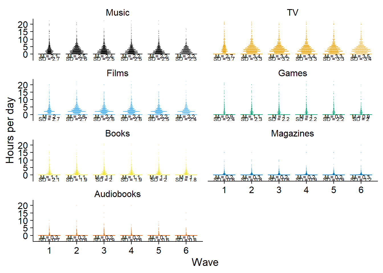
ggsave(
  here("figures", "figure2.png"),
  plot = figure2.3,
  width = 21 * 0.8,
  height = 29.7 * 0.8,
  units = "cm",
  dpi = 300
)
Then a separate plot for total time.
ggplot(
  dat %>%
    filter(measure == "Total"),
  aes(
    x = as.factor(wave),
    y = `Hours per day`,
    group = 1
  )
) +
  geom_quasirandom(size = 0.1, alpha = 0.2, color = "#CC79A7") +
  geom_line(
    data = dat_summary %>%
      filter(measure == "Total"),
    aes(
      y = mean
    ),
    size = 0.5,
    color = "#CC79A7"
  ) +
  geom_text(
    data = dat_summary %>%
      filter(measure == "Total"),
    aes(
      x = as.factor(wave),
      y = -1.2,
      label = paste0("M = ", mean)
    ),
    size = 3,
    color = "black"
  ) +
  geom_text(
    data = dat_summary %>%
      filter(measure == "Total"),
    aes(
      x = as.factor(wave),
      y = -2.4,
      label = paste0("SD = ", sd)
    ),
    size = 3,
    color = "black"
  ) +
  theme_cowplot() +
  xlab("Wave") +
  ylab("Total hours per day") +
  theme(
    strip.background.x = element_blank(),
    strip.background.y = element_blank(),
    legend.position = "none"
  ) -> figure3

figure3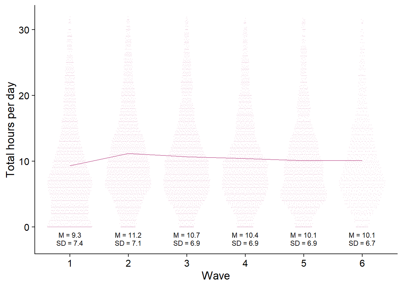
ggsave(
  here("figures", "figure3.png"),
  plot = figure3,
  width = 21 * 0.9,
  height = 29.7 * 0.4,
  units = "cm",
  dpi = 300
)
Then, I need to think of a way to visualize use vs. nonuse over time. Bar graphs could work, but that would mean a lot of bar graphs (one per medium) per wave, which is probably overwhelming. Plus, if I show raw counts, it could be confusing as well, simply because height of the bar != number of participants. If everyone at wave 1 used only one medium, but at wave two everyone used all media, it’ll look like an increase in sample size.
So proportions make the most sense, simple and straightforward.
# get proportions of users per medium and wave
dat <-
  working_file %>%
  pivot_longer(
    contains("_time"), # only the time variables
    names_to = "measure",
    values_to = "Hours per day"
  ) %>%
  mutate(
    # get use vs. no use in long format
    used = if_else(`Hours per day` == 0, 0, 1)
  ) %>%
  # no need for total time
  filter(used == 1, measure != "total_time") %>%
  # remove "tome appendix
  mutate(measure = as.factor(str_to_title(str_remove(measure, "_time")))) %>%
  # count how often a medium was used
  count(wave, measure, used) %>%
  # add total N per wave (of only those that will be included in analysis)
  left_join(
    .,
    working_file %>%
      count(wave, name = "N")
  ) %>%
  # get proprotion
  mutate(
    proportion = round(n / N, digits = 2) * 100,
    measure = fct_recode(measure, "TV" = "Tv"),
    measure = fct_relevel(
      measure,
      c(
        "Music",
        "TV",
        "Films",
        "Games",
        "Books",
        "Magazines",
        "Audiobooks"
      )
    )
  )

ggplot(
  dat,
  aes(
    x = as.factor(wave),
    y = proportion,
    group = measure,
    color = measure
  )
) +
  geom_point(size = 3) +
  geom_line(size = 1) +
  scale_colour_manual(values=cb_palette) +
  scale_fill_manual(values = cb_palette) +
  ylab("% of people who used medium") +
  xlab("Wave") +
  geom_dl(aes(label = measure), method = list(dl.trans(x = x + 0.25), "last.points", cex = 0.6)) +
  theme(
    legend.position = "none"
  ) -> figure4

figure4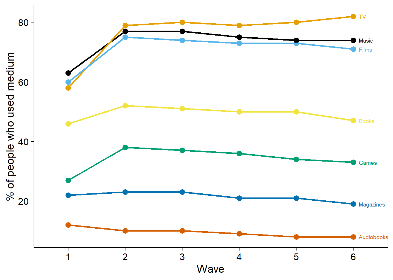
ggsave(
  here("figures", "figure4.png"),
  plot = figure4,
  width = 21 * 0.9,
  height = 29.7 * 0.4,
  units = "cm",
  dpi = 300
)
Next, I’ll do a beeswarm plot for well-being.
# temporary data file in long format
dat <-
  working_file %>%
  pivot_longer(
    c(affect, life_satisfaction), # only the aggregated well-being variables
    names_to = "measure",
    values_to = "Value"
  ) %>%
  mutate(
    measure = fct_recode(
      as.factor(measure),
      "Affect" = "affect",
      "Life satisfaction" = "life_satisfaction"
    )
  )

# summary stats for plotting means over time
dat_summary <-
  dat %>%
  group_by(wave, measure) %>%
  summarise(
    mean = mean(Value, na.rm = T),
    sd = sd(Value, na.rm = T)
  ) %>%
  mutate(
    across(
      mean:sd,
      ~ round(.x, digits = 1)
    )
  )

ggplot(
  dat,
  aes(
    x = as.factor(wave),
    y = Value,
    color = measure,
    fill = measure,
    group = 1
  )
) +
  geom_quasirandom(size = 0.1, alpha = 0.2) +
  geom_line(
    data = dat_summary,
    aes(
      y = mean
    ),
    size = 0.5
  ) +
  facet_wrap(~ measure, ncol = 2) +
  geom_text(
    data = dat_summary,
    aes(
      x = as.factor(wave),
      y = -0.5,
      label = paste0("M = ", mean)
    ),
    size = 2.5,
    color = "black"
  ) +
  geom_text(
    data = dat_summary,
    aes(
      x = as.factor(wave),
      y = -0.9,
      label = paste0("SD = ", sd)
    ),
    size = 2.5,
    color = "black"
  ) +
  theme_cowplot() +
  scale_colour_manual(values=c("#E69F00", "#000000")) +
  scale_fill_manual(values = c("#E69F00", "#000000")) +
  xlab("Wave") +
  theme(
    axis.title.y = element_blank(),
    strip.background.x = element_blank(),
    strip.background.y = element_blank(),
    legend.position = "none"
  ) -> figure5

figure5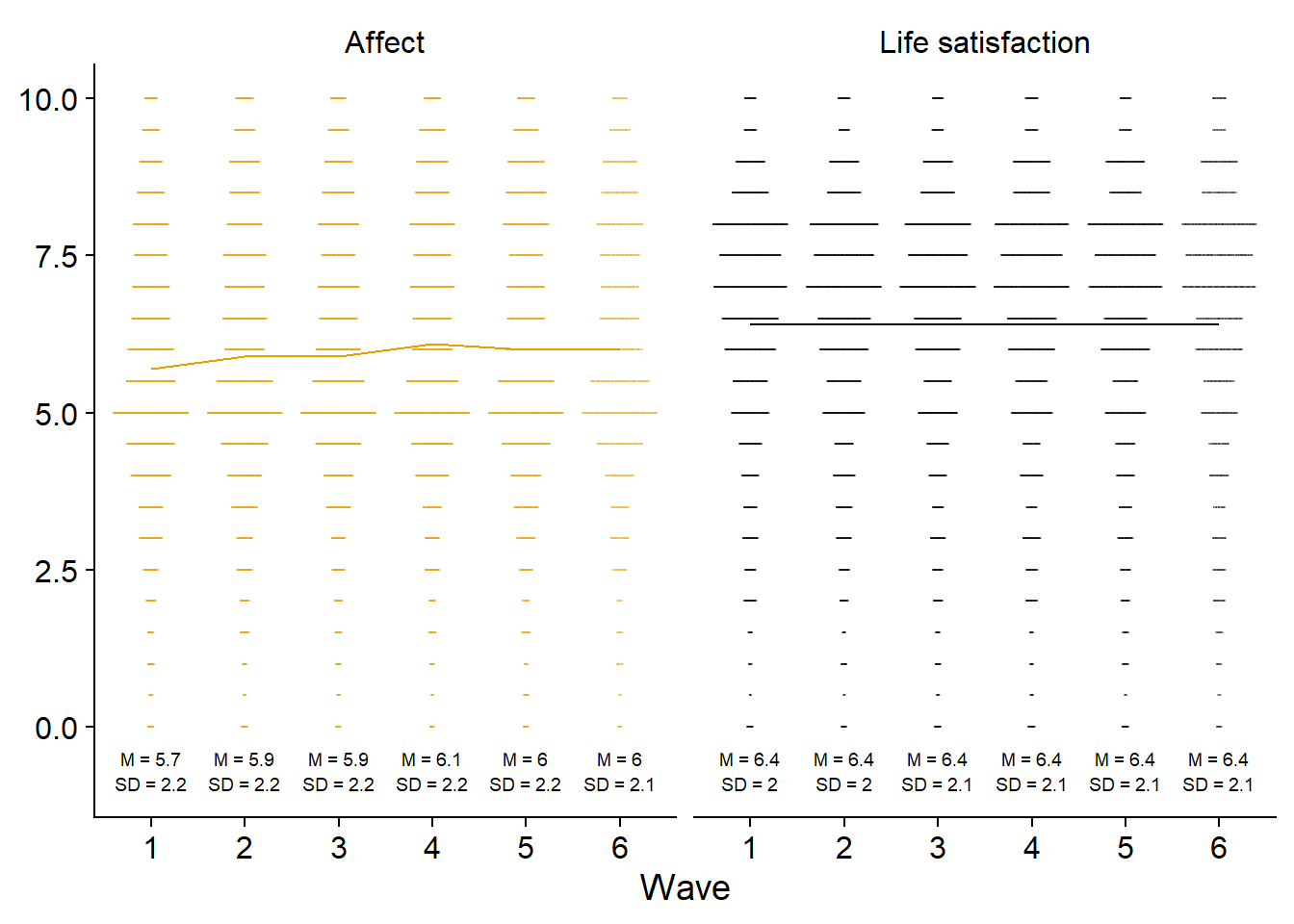
ggsave(
  here("figures", "figure5.png"),
  plot = figure5,
  width = 21 * 0.8,
  height = 29.7 * 0.4,
  units = "cm",
  dpi = 300
)