4 Describe & explore
Here, we get the descriptive info for both studies that we report in the Method section of the paper.
We used these packages:
library(pacman)
p_load(
  knitr,
  here,
  visdat,
  scales,
  patchwork,
  sjPlot,
  cowplot,
  janitor,
  ggbeeswarm,
  lemon,
  lubridate,
  tidyverse
)
Then, we load the data sets.
ac <- read_rds(here("data/noa/ac-excluded.rds"))
pvz <- read_rds(here("data/ea/pvz-excluded.rds"))

ac_full <- read_rds(here("data/noa/ac.rds"))
pvz_full <- read_rds(here("data/ea/pvz.rds"))
Join the two data sets.
ac <- ac %>%
  select(
    player_id, gender, created, age,
    spane_balance, spane_positive, spane_negative,
    spane_game_balance, within_estimate, between_estimate,
    autonomy,
    competence, relatedness, enjoyment,
    extrinsic, active_play, Hours
  )
pvz <- pvz %>%
  select(
    player_id, gender, created = date, age,
    spane_balance, spane_positive, spane_negative,
    spane_game_balance, within_estimate, between_estimate,
    autonomy,
    competence, relatedness, enjoyment,
    extrinsic, active_play, Hours
  )
dat <- bind_rows(pvz, ac, .id = "Game") %>%
  mutate(Game = factor(Game, labels = c("PvZ", "AC:NH")))
4.1 Demographics
In total, 6484 players responded to the survey. Their mean age was M = 31 with a standard deviation of SD = 10.
Ages by study:
dat %>%
  group_by(Game) %>%
  summarise(
    m_age = mean(age, na.rm = TRUE),
    s_age = sd(age, na.rm = TRUE),
    min_age = min(age, na.rm = TRUE),
    max_age = max(age, na.rm = TRUE)
    )
#> # A tibble: 2 x 5
#>   Game  m_age s_age   min_age   max_age
#>   <fct> <dbl> <dbl> <dbl+lbl> <dbl+lbl>
#> 1 PvZ    34.9 11.8         18        99
#> 2 AC:NH  30.9  9.68        18        99
Then let’s look at the sex distribution.
tabyl(pvz, gender) %>% adorn_pct_formatting()
#>             gender   n percent
#>               Male 404   78.1%
#>             Female  94   18.2%
#>              Other   2    0.4%
#>  Prefer not to say  17    3.3%
tabyl(ac, gender) %>% adorn_pct_formatting()
#>                                  gender    n percent valid_percent
#>                                  Female 2462   41.3%         42.3%
#>                                    Male 3124   52.4%         53.6%
#>                                   Other  153    2.6%          2.6%
#>                       Prefer not to say   88    1.5%          1.5%
#>  Item was never rendered for this user.    0    0.0%          0.0%
#>                                    <NA>  140    2.3%             -
4.2 Survey dates
dat %>%
  mutate(Date = as.Date(created)) %>%
  count(Game, Date) %>%
kable()| Game | Date | n |
|---|---|---|
| PvZ | 2020-08-11 | 69 |
| PvZ | 2020-08-12 | 9 |
| PvZ | 2020-08-13 | 7 |
| PvZ | 2020-08-15 | 1 |
| PvZ | 2020-08-16 | 1 |
| PvZ | 2020-08-17 | 1 |
| PvZ | 2020-08-18 | 1 |
| PvZ | 2020-08-20 | 1 |
| PvZ | 2020-08-21 | 1 |
| PvZ | 2020-08-23 | 1 |
| PvZ | 2020-08-28 | 1 |
| PvZ | 2020-09-24 | 320 |
| PvZ | 2020-09-25 | 64 |
| PvZ | 2020-09-26 | 21 |
| PvZ | 2020-09-27 | 12 |
| PvZ | 2020-09-28 | 5 |
| PvZ | 2020-09-29 | 2 |
| AC:NH | 2020-10-27 | 236 |
| AC:NH | 2020-10-28 | 4942 |
| AC:NH | 2020-10-29 | 450 |
| AC:NH | 2020-10-30 | 171 |
| AC:NH | 2020-10-31 | 57 |
| AC:NH | 2020-11-01 | 55 |
| AC:NH | 2020-11-02 | 56 |
4.3 Response rates
# PvZ wave 1
p1 <- nrow(pvz_full %>% filter(date < ymd("2020-09-01")))
# PvZ wave 2
p2 <- nrow(pvz_full %>% filter(date > ymd("2020-09-01")))
# AC:NH
a1 <- nrow(ac)
tibble(
  Game = c("PvZ w1", "PvZ w2", "AC:NH"),
  Invitations = c(50000, 200000, 342825),
  Responses = c(p1, p2, a1),
  Rate = percent(Responses/Invitations, .01)
)
#> # A tibble: 3 x 4
#>   Game   Invitations Responses Rate
#>   <chr>        <dbl>     <int> <chr>
#> 1 PvZ w1       50000        94 0.19%
#> 2 PvZ w2      200000       424 0.21%
#> 3 AC:NH       342825      5967 1.74%
How many individuals had telemetry
foo <- function(data) {
  data %>%
    transmute(has_telemetry = !is.na(Hours)) %>%
    tabyl(has_telemetry) %>%
    adorn_pct_formatting()
}
map(list(pvz=pvz_full, ac=ac_full), foo) %>% kable
|
|
4.4 Missingness
vis_miss(pvz)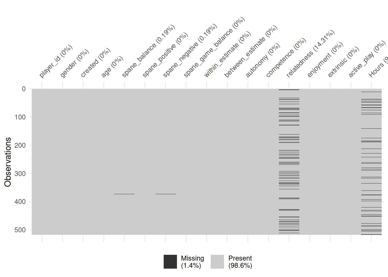
vis_miss(ac)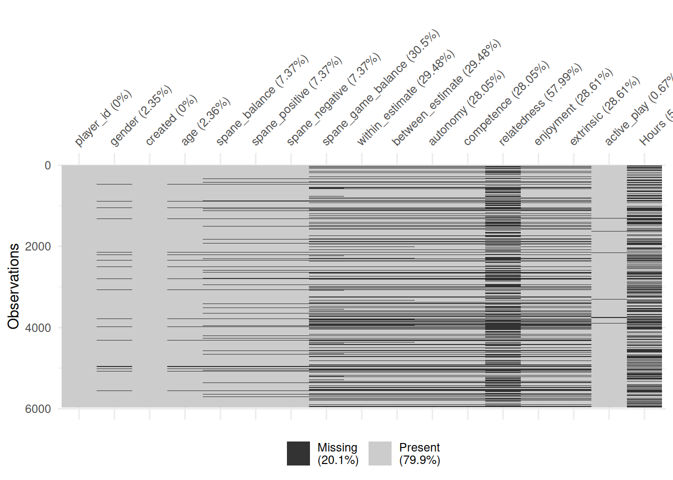
4.5 Univariate figures
This figure shows the distribution of well-being and motivation scores for both studies
tmp <- dat %>%
  pivot_longer(c(spane_balance, autonomy:extrinsic))
tmp <- tmp %>%
  mutate(
    name = factor(
      name,
      levels = c(
        "spane_balance", "extrinsic", "enjoyment",
        "autonomy", "competence", "relatedness"
      ),
      labels = c(
        "Player well-being", "Extrinsic motivation", "Intrinsic motivation",
        "Player autonomy", "Player competence", "Player relatedness"
      )
    )
  )
tmp2 <- tmp %>%
  group_by(Game, name) %>%
  summarise(value = mean(value, na.rm = TRUE))
filter(tmp, Game == "PvZ") %>%
  ggplot(aes(value, col = Game, fill = Game)) +
  coord_cartesian(ylim = c(-1, 1)) +
  scale_color_manual(
    values = rev(colors), aesthetics = c("color", "fill"),
    guide = guide_legend(reverse = TRUE)
    ) +
  geom_histogram(
    aes(y = stat(ncount)),
    col = "white", bins = 20
    ) +
  geom_histogram(
    data = filter(tmp, Game == "AC:NH"),
    aes(y = stat(ncount)*-1), col = "white", bins = 20
    ) +
  scale_y_continuous(
    breaks = c(-1, -.5, 0, .5, 1), labels = c(1, .5, 0, .5, 1)
  ) +
  scale_x_continuous("Value", breaks = pretty_breaks()) +
  geom_point(
    data = tmp2, aes(y = -1.01),
    shape = 25, size = 2.5
    ) +
  # Make sure 1 is shown on all figures by drawing a blank geom
  geom_blank(data = tibble(Game = "PvZ", value = 1)) +
  labs(y = "Normalized count") +
  facet_wrap("name", scales = "free") +
  theme(axis.title.x = element_blank(), legend.position = "right")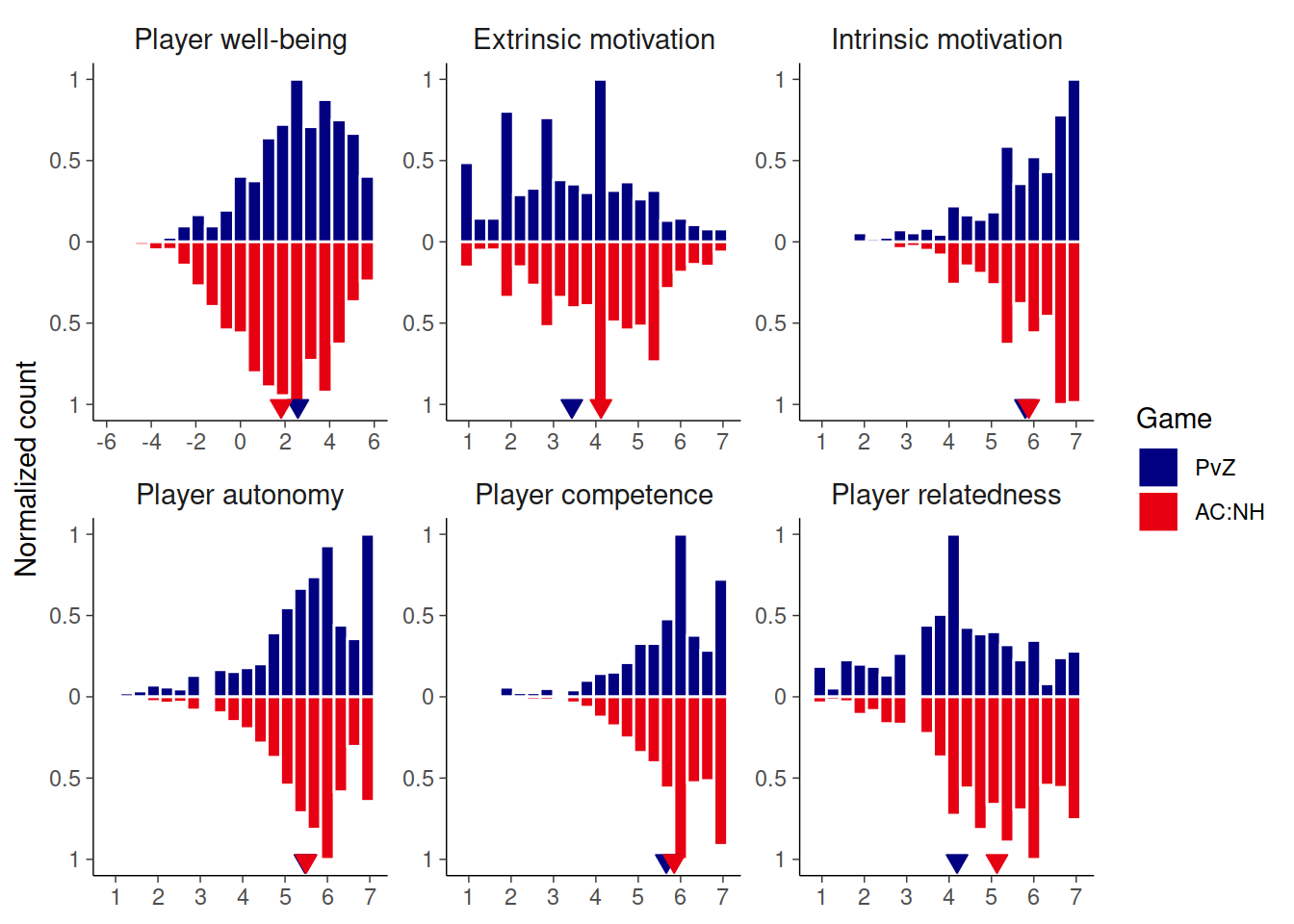
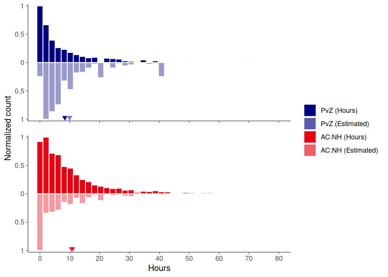
And then a summary figure of the times, subjective and objective. Means indicate means over participants who had both measures.
# Histograms show all participants
tmp <- dat %>%
  select(Game, Hours, active_play) %>%
  pivot_longer(-Game) %>%
  mutate(name = ifelse(name=="Hours", "Hours", "Estimated")) %>%
  mutate(Game2 = str_glue("{Game} ({name})"))

# Summaries over people who had both metrics
tmp2 <- dat %>%
  select(Game, Hours, active_play) %>%
  drop_na(active_play, Hours) %>%
  pivot_longer(-Game) %>%
  mutate(name = ifelse(name=="Hours", "Hours", "Estimated")) %>%
  mutate(Game2 = str_glue("{Game} ({name})")) %>%
  group_by(Game, Game2, name) %>%
  summarise(m = mean(value, na.rm = TRUE), n = n())
# This is really complicated because of the legend
tmp %>%
  ggplot(aes(fill = Game2, alpha = Game2)) +
  # Use two variables to control facets and colors/alpha
  # Such that legend is constructed appropriately
  scale_fill_manual(
    values = rep(rev(colors), each = 2),
    guide = guide_legend(reverse = TRUE)
  ) +
  scale_alpha_manual(
    values = c(.4, 1, .4, 1),
    guide = guide_legend(reverse = TRUE)
  ) +
  scale_y_continuous(
    breaks = c(-1, -.5, 0, .5, 1), labels = c(1, .5, 0, .5, 1),
    expand = expansion(.015)
  ) +
  scale_x_continuous(breaks = pretty_breaks(7)) +
  coord_cartesian(ylim = c(-1, 1), xlim = c(0, 80)) +
  labs(x = "Hours", y = "Normalized count") +
  # Use different geoms to pick appropriate variables
  geom_histogram(
    data = filter(tmp, name=="Hours"),
    aes(x = value, y = stat(ncount)),
    bins = 80, col = "white"
  ) +
  geom_histogram(
    data = filter(tmp, name=="Estimated"),
    aes(x = value, y = stat(ncount) * -1),
    bins = 80, col = "white"
  ) +
  geom_point(
    data = filter(tmp2, name=="Hours"), aes(x = m, y = -0.97),
    shape = 25, size = 2.5, show.legend = FALSE,
    col = "white"
  ) +
  geom_point(
    data = filter(tmp2, name=="Estimated"), aes(x = m, y = -0.97),
    shape = 25, size = 2.5, alpha = 0.5, show.legend = FALSE,
    col = "white"
  ) +
  facet_rep_wrap("Game", scales = "fixed", nrow = 2) +
  theme(
    strip.text = element_blank(),
    legend.position = "right",
    legend.title = element_blank()
  )
# Summary of values truncated from graph
dat %>%
  group_by(Game) %>%
  summarise(
    across(
      active_play:Hours,
      list(
        n = ~sum(!is.na(.x)),
        x = ~sum(.x>80, na.rm = TRUE),
        p = ~percent(sum(.x>80, na.rm = TRUE) / sum(!is.na(.x)), .01)
      )
    )
  )
#> # A tibble: 2 x 7
#>   Game  active_play_n active_play_x active_play_p Hours_n Hours_x Hours_p
#>   <fct>         <int>         <int> <chr>           <int>   <int> <chr>
#> 1 PvZ             517             0 0.00%             469       0 0.00%
#> 2 AC:NH          5927            58 0.98%            2737       7 0.26%
dat %>%
  group_by(Game) %>%
  summarise(
    across(
      active_play:Hours,
      ~max(.x, na.rm = T)
    )
  )
#> # A tibble: 2 x 3
#>   Game  active_play Hours
#>   <fct>       <dbl> <dbl>
#> 1 PvZ          41.0  69.3
#> 2 AC:NH       161.   99.8
4.6 Correlation matrices
cormat <- function(data, title) {
  data %>%
    rename_all(str_to_title) %>%
    psych::cor.plot(
      scale = FALSE, stars = TRUE,
      xlas = 2, show.legend = FALSE,
      main = str_glue("{title} correlation matrix"),
    )
}

select(pvz, where(is.numeric)) %>%
  cormat("PvZ")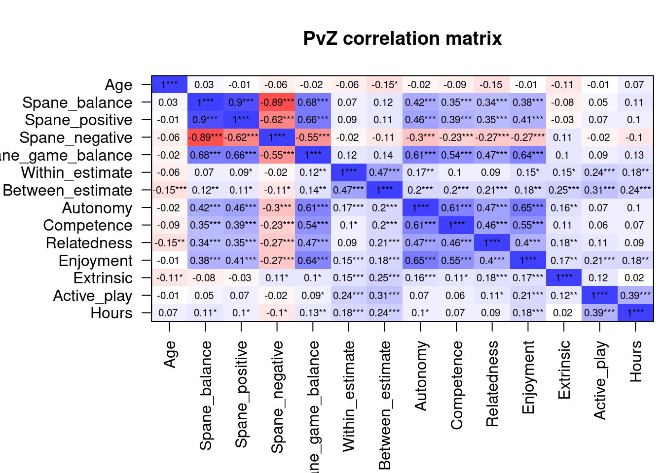
select(ac, where(is.numeric)) %>%
  cormat("AC:NH")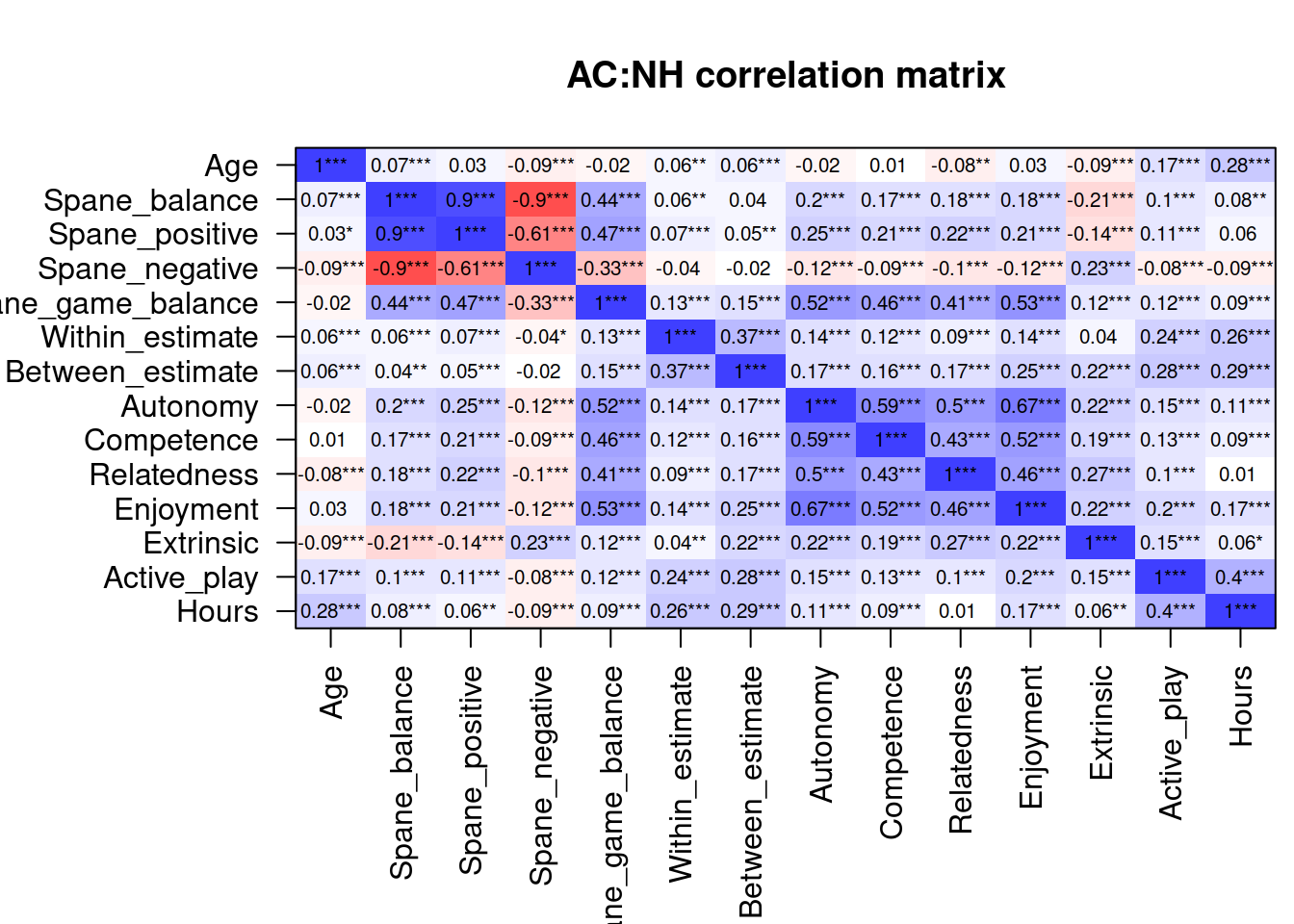
Then we will draw scatterplot matrices, with this custom function:
lm_function <-
  function(
    data,
    mapping,
    ...
    ){
  p <-
    ggplot(
      data = data,
      mapping = mapping
      ) +
    geom_point(
      color = "#56B4E9",
      alpha = 0.5
    ) +
    geom_smooth(
      method=lm,
      fill="#0072B2",
      color="#0072B2",
      ...)
  p
}

dens_function <-
  function(
    data,
    mapping,
    ...
  ){
    p <-
      ggplot(
        data = data,
        mapping = mapping
      ) +
      geom_density(fill = "#009E73", color = NA, alpha = 0.5)
  }

pair_plot <-
  function(
    dat
  ) {
    GGally::ggpairs(
      data = dat,
      lower = list(continuous = lm_function), # custom helper function
      diag = list(continuous = dens_function), # custom helper function
    ) +
      theme(
        axis.line=element_blank(),
        axis.text.x=element_blank(),
        axis.text.y=element_blank(),
        axis.ticks=element_blank(),
        axis.title.y=element_blank(),
        axis.title.x=element_blank(),
        legend.position="none",
        panel.background=element_blank(),
        panel.border=element_blank(),
        panel.grid.major=element_blank(),
        panel.grid.minor=element_blank(),
        plot.background=element_blank(),
        strip.background = element_blank()
      )
  }
4.6.1 Well-being & motivations correlations
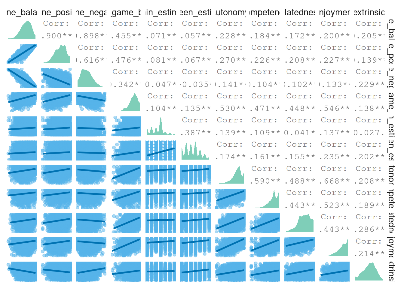
Let’s have a look at the correlations between the concepts of well-being and motivations (aggregated).
# call the function
pair_plot(
  dat%>%
    select(
      spane_balance:extrinsic,
      spane_game_balance
    )
)
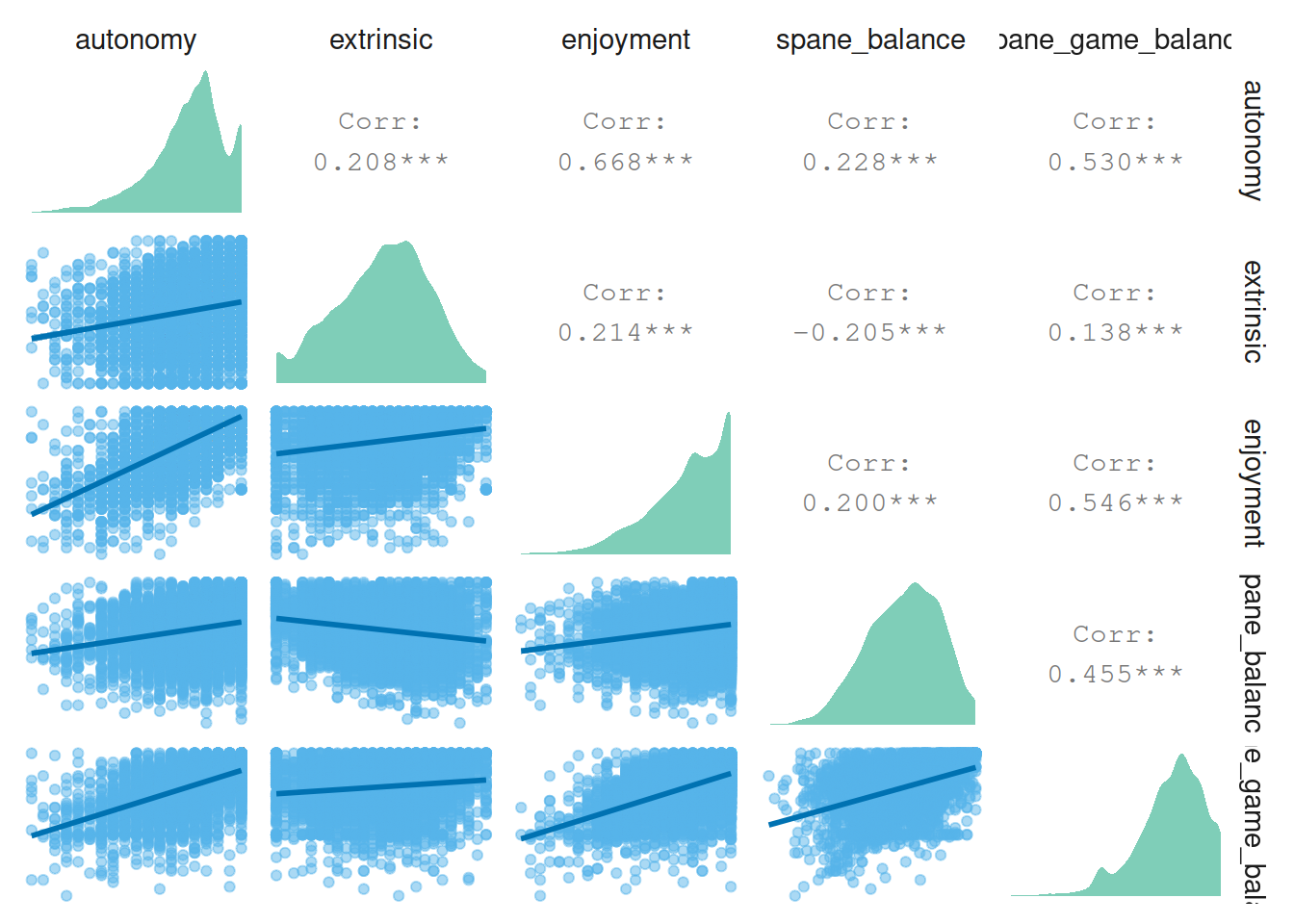
4.6.2 More well-being correlations
Then correlations between well-being, autonomy motivation, enjoyment, and extrinsic motivation.
pair_plot(
  dat %>%
    select(
      autonomy,
      extrinsic,
      enjoyment,
      spane_balance,
      spane_game_balance
    )
)
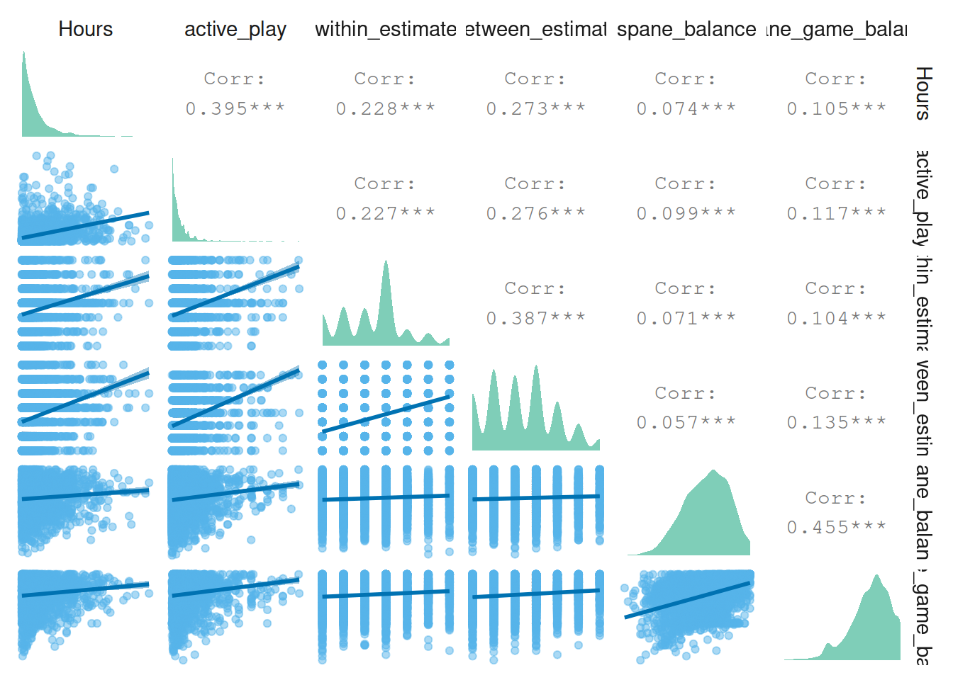
Next relations between self-estimated play (effects) and well-being.
pair_plot(
  dat %>%
    select(
      Hours,
      active_play,
      within_estimate,
      between_estimate,
      spane_balance,
      spane_game_balance
    )
  )
4.7 Plot studies combined
Then, let’s plot and describe demographic information. The plots in this section will be for both studies combined.
# raincloud plot function from https://github.com/RainCloudPlots/RainCloudPlots/blob/master/tutorial_R/R_rainclouds.R
# Defining the geom_flat_violin function ----
# Note: the below code modifies the
# existing github page by removing a parenthesis in line 50
"%||%" <- function(a, b) {
if (!is.null(a)) a else b
}
geom_flat_violin <- function(mapping = NULL, data = NULL, stat = "ydensity",
position = "dodge", trim = TRUE, scale = "area",
show.legend = NA, inherit.aes = TRUE, ...) {
layer(
data = data,
mapping = mapping,
stat = stat,
geom = GeomFlatViolin,
position = position,
show.legend = show.legend,
inherit.aes = inherit.aes,
params = list(
trim = trim,
scale = scale,
...
)
)
}
#' @rdname ggplot2-ggproto
#' @format NULL
#' @usage NULL
#' @export
GeomFlatViolin <-
ggproto("GeomFlatViolin", Geom,
setup_data = function(data, params) {
data$width <- data$width %||%
params$width %||% (resolution(data$x, FALSE) * 0.9)
# ymin, ymax, xmin, and xmax define the bounding rectangle for each group
data %>%
group_by(group) %>%
mutate(
ymin = min(y),
ymax = max(y),
xmin = x,
xmax = x + width / 2
)
},
draw_group = function(data, panel_scales, coord) {
# Find the points for the line to go all the way around
data <- transform(data,
xminv = x,
xmaxv = x + violinwidth * (xmax - x)
)
# Make sure it's sorted properly to draw the outline
newdata <- rbind(
plyr::arrange(transform(data, x = xminv), y),
plyr::arrange(transform(data, x = xmaxv), -y)
)
# Close the polygon: set first and last point the same
# Needed for coord_polar and such
newdata <- rbind(newdata, newdata[1, ])
ggplot2:::ggname("geom_flat_violin", GeomPolygon$draw_panel(newdata, panel_scales, coord))
},
draw_key = draw_key_polygon,
default_aes = aes(
weight = 1, colour = "grey20", fill = "white", size = 0.5,
alpha = NA, linetype = "solid"
),
required_aes = c("x", "y")
)
# function that returns summary stats
describe <- function(
dat,
variable,
trait = FALSE
){
# if variable is not repeated-measures, take only one measure per participant
if (trait == TRUE){
dat <-
dat %>%
group_by(player_id) %>%
slice(1) %>%
ungroup()
}
# then get descriptives
descriptives <-
dat %>%
filter(!is.na(UQ(sym(variable)))) %>% # remove missing values
summarise(
across(
!! variable,
list(
N = ~ n(),
mean = mean,
sd = sd,
median = median,
min = min,
max = max,
cilow = ~Rmisc::CI(.x)[[3]], # lower CI
cihigh = ~Rmisc::CI(.x)[[1]] # upper CI
)
)
)
descriptives <-
descriptives %>%
# only keep measure
rename_all(
~ str_remove(
.,
paste0(variable, "_")
)
) %>%
mutate(
variable = variable,
range = max - min
) %>%
relocate(variable) %>%
relocate(
range,
.after = max
)
return(descriptives)
}
single_cloud <-
function(
raw_data,
summary_data,
variable,
color,
title,
trait = FALSE
){
# take only one row per person if it's a trait variable
if (trait == TRUE){
raw_data <-
raw_data %>%
group_by(player_id) %>%
slice(1) %>%
ungroup()
}
# the plot
p <-
ggplot(
raw_data %>%
mutate(Density = 1),
aes(
x = Density,
y = get(variable)
)
) +
geom_flat_violin( # the "cloud"
position = position_nudge(x = .2, y = 0),
adjust = 2,
color = NA,
fill = color,
alpha = 0.5
) +
geom_point( # the "rain"
position = position_jitter(width = .15),
size = 1,
color = color,
alpha = 0.5
) +
geom_point( # the mean from the summary stats
data = summary_data %>%
filter(variable == !! variable) %>%
mutate(Density = 1),
aes(
x = Density + 0.175,
y = mean
),
color = color,
size = 2.5
) +
geom_errorbar( # error bars
data = summary_data %>%
filter(variable == !! variable) %>%
mutate(Density = 1),
aes(
x = Density + 0.175,
y = mean,
ymin = cilow,
ymax = cihigh
),
width = 0,
size = 0.8,
color = color
) +
ylab(title) +
theme_cowplot() +
theme(
axis.text.y = element_blank(),
axis.ticks.y = element_blank(),
axis.ticks.x = element_blank(),
axis.title.y = element_blank(),
axis.line = element_blank()
) +
guides(
color = FALSE,
fill = FALSE
) +
coord_flip()
return(p)
}
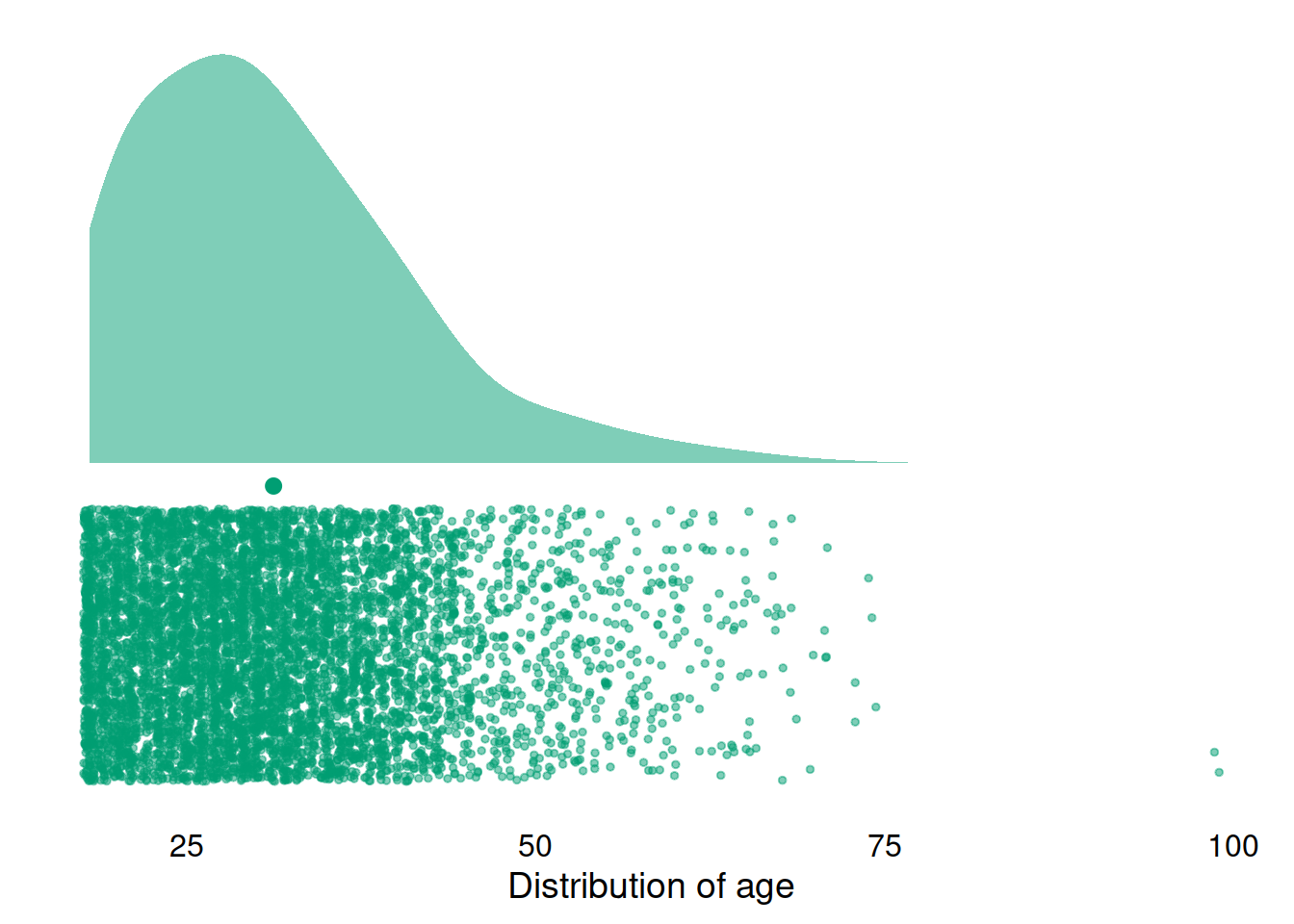
single_cloud(
dat,
describe(dat, "age", trait = FALSE),
"age",
"#009E73",
"Distribution of age"
)
And a check of the variable distributions.
p1 <-
  single_cloud(
    pvz,
    describe(pvz, "spane_balance", trait = TRUE),
    "spane_balance",
    "#56B4E9",
    title = "SPANE Balance",
    trait = TRUE
  )

p2 <-
  single_cloud(
    pvz,
    describe(pvz, "autonomy", trait = TRUE),
    "autonomy",
    "#009E73",
    title = "Autonomy",
    trait = TRUE
  )

p3 <-
  single_cloud(
    pvz,
    describe(pvz, "competence", trait = TRUE),
    "competence",
    "#F0E442",
    title = "Competence",
    trait = TRUE
  )

p4 <-
  single_cloud(
    pvz,
    describe(pvz, "relatedness", trait = TRUE),
    "relatedness",
    "#000000",
    title = "Relatedness",
    trait = TRUE
  )

p5 <-
  single_cloud(
    pvz,
    describe(pvz, "enjoyment", trait = TRUE),
    "enjoyment",
    "#0072B2",
    title = "Enjoyment",
    trait = TRUE
  )

p6 <-
  single_cloud(
    pvz,
    describe(pvz, "extrinsic", trait = TRUE),
    "extrinsic",
    "#D55E00",
    title = "Extrinsic motivation",
    trait = TRUE
  )

p7 <-
  single_cloud(
    pvz,
    describe(pvz, "active_play", trait = TRUE),
    "active_play",
    "#CC79A7",
    title = "Self-estimated play",
    trait = TRUE
  )

(p1 | p2) / (p3 | p4) / (p5 | p6) / p7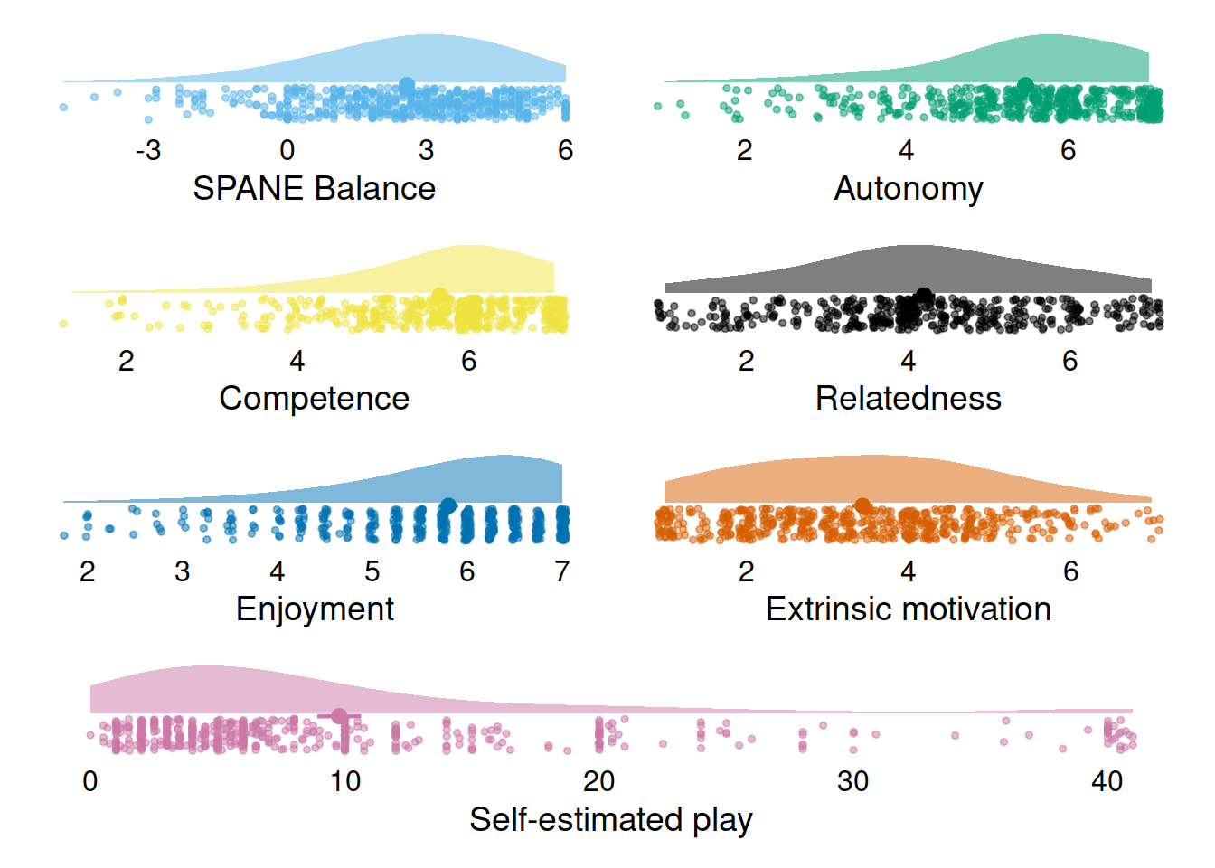
4.8 Create summary figure
Alright, here I’ll create a summary figure that shows a beeswarm plot for each of the variables we’re interested in.
First, because we’ll plot per measure, let’s turn the data into the long format.
dat_long <-
  dat %>%
  pivot_longer(
    spane_balance:Hours,
    names_to = "Variable",
    values_to = "value"
  ) %>%
  mutate(Variable = as.factor(Variable))
Now, let’s get summary stats for each measure.
# function to get summary stats
get_summary <-
  function(
    dat
  ) {
    summary_stats <-
      dat %>%
      group_by(Game) %>%
      summarise(
        across(
          spane_balance:Hours,
          list(
            N = ~ sum(!is.na(.x)),
            Mean = ~ mean(.x, na.rm = TRUE),
            SD = ~ sd(.x, na.rm = TRUE),
            Median = ~ median(.x, na.rm = TRUE),
            Min = ~ min(.x, na.rm = TRUE),
            Max = ~ max(.x, na.rm = TRUE),
            `Lower 95%CI` = ~Rmisc::CI(na.omit(.x))[[3]], # lower CI
            `Upper 95%CI` = ~Rmisc::CI(na.omit(.x))[[1]]
          )
        )
      ) %>%

      # get into long format
      pivot_longer(
        -Game,
        names_to = c("Variable", "Measure"),
        values_to = "Value",
        names_pattern = "(.*)_([^_]+$)" # match by last occurrence of underscore
      ) %>%

      # and back to wide format
      pivot_wider(
        id_cols = c(Game, Variable),
        names_from = Measure,
        values_from = Value
      )

    return(summary_stats)
    }

summary_stats <- get_summary(dat)

# rename both so that we have the same order of factor levels for the figure
rename_and_relevel <-
  function(
    dat
  ) {
    dat <-
      dat %>%
      mutate(
        Variable = fct_relevel(
          Variable,
          "SPANE" = "spane_balance",
          "Hours",
          "active_play",
          "autonomy",
          "competence",
          "relatedness",
          "enjoyment",
          "extrinsic"
        ),

      Variable = fct_recode(
        Variable,
        "Affective well-being" = "spane_balance",
        "Objective play time" = "Hours",
        "Self-reported play time" = "active_play",
        "Autonomy" = "autonomy",
        "Competence" = "competence",
        "Relatedness" = "relatedness",
        "Enjoyment" = "enjoyment",
        "Extrinsic" = "extrinsic"
      )
    )

    return(dat)
  }

dat_long <- rename_and_relevel(dat_long)
summary_stats <- rename_and_relevel(summary_stats)
And then the beeswarm plots.
summary_stats <-
  summary_stats %>%
  group_by(Variable) %>%
  mutate( # the position of geom_text
    x = max(Max) * 0.85,
    across(
      c(Mean, SD),
      ~ format(round(.x, digits = 1), nsmall = 1)
    )
  )

# a function because we "split" up the plot with patchwork
beeswarm_plots <-
  function(
    dat,
    subset,
    mean_position,
    sd_position,
    col_font_size,
    row_font_size
  ){
    ggplot(
      dat %>%
        filter(
          Variable %in% subset
        ),
      aes(
        x = value,
        y = 1,
        color = Game
      )
    ) +
      geom_quasirandom(
        size = 1,
        groupOnX = FALSE,
        shape = 1,
        alpha = 0.8
      ) +
      facet_grid(
        Game ~ Variable,
        scales = "free_x"
      ) +
      geom_text(
        data = summary_stats %>%
          filter(Variable %in% subset),
        aes(
          x = x,
          y = mean_position,
          label = paste0("M = ", Mean)
        ),
        color = "black",
        size = 2.5
      ) +
      geom_text(
        data = summary_stats %>%
          filter(Variable %in% subset),
        aes(
          x = x,
          y = sd_position,
          label = paste0("SD = ", SD)
        ),
        color = "black",
        size = 2.5
      ) +
      facet_rep_grid(
        Game ~ Variable,
        scales = "free_x"
      ) +
      scale_color_manual(values=c("navyblue", "#E60012")) +
      theme(
        axis.text.y = element_blank(),
        axis.title.x = element_blank(),
        axis.ticks.y = element_blank(),
        axis.title.y = element_blank(),
        axis.line = element_line(),
        panel.grid.major = element_blank(),
        panel.grid.minor = element_blank(),
        panel.background = element_blank(),
        strip.background.x = element_blank(),
        strip.background.y = element_blank(),
        strip.text.x = element_text(size = col_font_size),
        strip.text.y = element_text(size = row_font_size),
        legend.position = "none"
      ) -> p

    return(p)
  }

p1 <-
  beeswarm_plots(
    dat_long,
    c("Competence", "Relatedness", "Enjoyment", "Extrinsic", "Autonomy"),
    1.65,
    1.5,
    10,
    11
  )

p2 <-
  beeswarm_plots(
    dat_long,
    c("Affective well-being", "Objective play time", "Self-reported play time"),
    2.0,
    1.8,
    10,
    11
  )

p2 / p1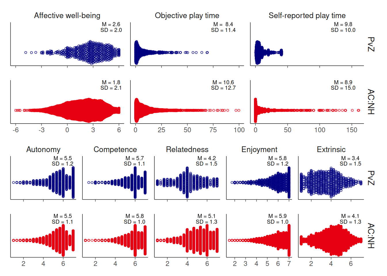
4.9 Session info
sessionInfo()
#> R version 4.0.3 (2020-10-10)
#> Platform: x86_64-pc-linux-gnu (64-bit)
#> Running under: Ubuntu 20.04.1 LTS
#>
#> Matrix products: default
#> BLAS:   /usr/lib/x86_64-linux-gnu/openblas-pthread/libblas.so.3
#> LAPACK: /usr/lib/x86_64-linux-gnu/openblas-pthread/liblapack.so.3
#>
#> locale:
#>  [1] LC_CTYPE=C.UTF-8       LC_NUMERIC=C           LC_TIME=C.UTF-8
#>  [4] LC_COLLATE=C.UTF-8     LC_MONETARY=C.UTF-8    LC_MESSAGES=C.UTF-8
#>  [7] LC_PAPER=C.UTF-8       LC_NAME=C              LC_ADDRESS=C
#> [10] LC_TELEPHONE=C         LC_MEASUREMENT=C.UTF-8 LC_IDENTIFICATION=C
#>
#> attached base packages:
#> [1] stats     graphics  grDevices utils     datasets  methods   base
#>
#> other attached packages:
#>  [1] forcats_0.5.0     stringr_1.4.0     dplyr_1.0.2       purrr_0.3.4
#>  [5] readr_1.4.0       tidyr_1.1.2       tibble_3.0.4      tidyverse_1.3.0
#>  [9] lubridate_1.7.9.2 lemon_0.4.5       ggbeeswarm_0.6.0  ggplot2_3.3.2
#> [13] janitor_2.0.1     cowplot_1.1.0     sjPlot_2.8.6      patchwork_1.1.0
#> [17] scales_1.1.1      visdat_0.5.3      here_1.0.1        knitr_1.30
#> [21] pacman_0.5.1
#>
#> loaded via a namespace (and not attached):
#>  [1] nlme_3.1-150      fs_1.5.0          insight_0.11.1    httr_1.4.2
#>  [5] rprojroot_2.0.2   tools_4.0.3       backports_1.2.1   utf8_1.1.4
#>  [9] R6_2.5.0          sjlabelled_1.1.7  vipor_0.4.5       DBI_1.1.0
#> [13] colorspace_2.0-0  withr_2.3.0       mnormt_2.0.2      tidyselect_1.1.0
#> [17] gridExtra_2.3     emmeans_1.5.3     compiler_4.0.3    cli_2.2.0
#> [21] performance_0.6.1 rvest_0.3.6       xml2_1.3.2        sandwich_3.0-0
#> [25] labeling_0.4.2    bookdown_0.21     bayestestR_0.8.0  psych_2.0.9
#> [29] mvtnorm_1.1-1     digest_0.6.27     minqa_1.2.4       rmarkdown_2.6
#> [33] pkgconfig_2.0.3   htmltools_0.5.0   lme4_1.1-26       highr_0.8
#> [37] dbplyr_2.0.0      Rmisc_1.5         rlang_0.4.9       readxl_1.3.1
#> [41] rstudioapi_0.13   farver_2.0.3      generics_0.1.0    zoo_1.8-8
#> [45] jsonlite_1.7.2    magrittr_2.0.1    parameters_0.10.1 Matrix_1.2-18
#> [49] fansi_0.4.1       Rcpp_1.0.5        munsell_0.5.0     lifecycle_0.2.0
#> [53] stringi_1.5.3     multcomp_1.4-15   yaml_2.2.1        snakecase_0.11.0
#> [57] MASS_7.3-53       plyr_1.8.6        grid_4.0.3        parallel_4.0.3
#> [61] sjmisc_2.8.5      crayon_1.3.4      lattice_0.20-41   ggeffects_1.0.1
#> [65] haven_2.3.1       splines_4.0.3     sjstats_0.18.0    hms_0.5.3
#> [69] tmvnsim_1.0-2     pillar_1.4.7      boot_1.3-25       estimability_1.3
#> [73] effectsize_0.4.1  codetools_0.2-18  reprex_0.3.0      glue_1.4.2
#> [77] evaluate_0.14     modelr_0.1.8      vctrs_0.3.5       nloptr_1.2.2.2
#> [81] cellranger_1.1.0  gtable_0.3.0      assertthat_0.2.1  xfun_0.19
#> [85] xtable_1.8-4      broom_0.7.2       coda_0.19-4       survival_3.2-7
#> [89] beeswarm_0.2.3    statmod_1.4.35    TH.data_1.0-10    ellipsis_0.3.1